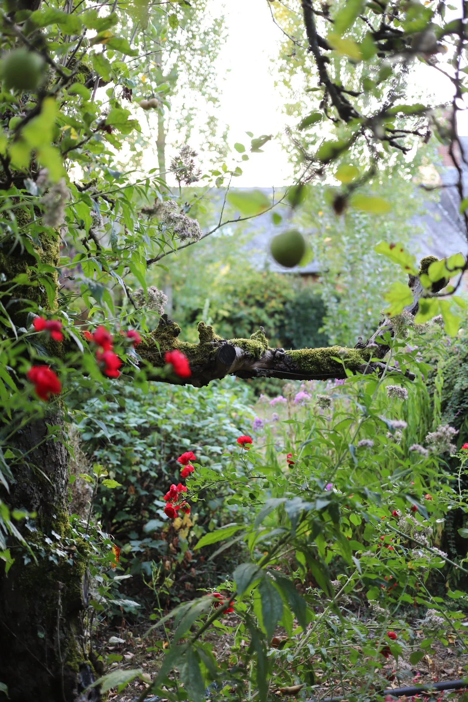
Behind Common Thread 04 — Lights & Places
Throughout Common Thread, I found myself looking less at colour itself and more at light.
From January to December, I looked closely at the light of each season — the first light of spring, the quiet glow of dawn, the feeling of flowers beginning to bloom through the morning mist, the rays of light growing stronger as summer approaches, the changing light in an autumn forest, and the warmth of a small light in winter.
I wanted to translate these different qualities of light into knitwear.
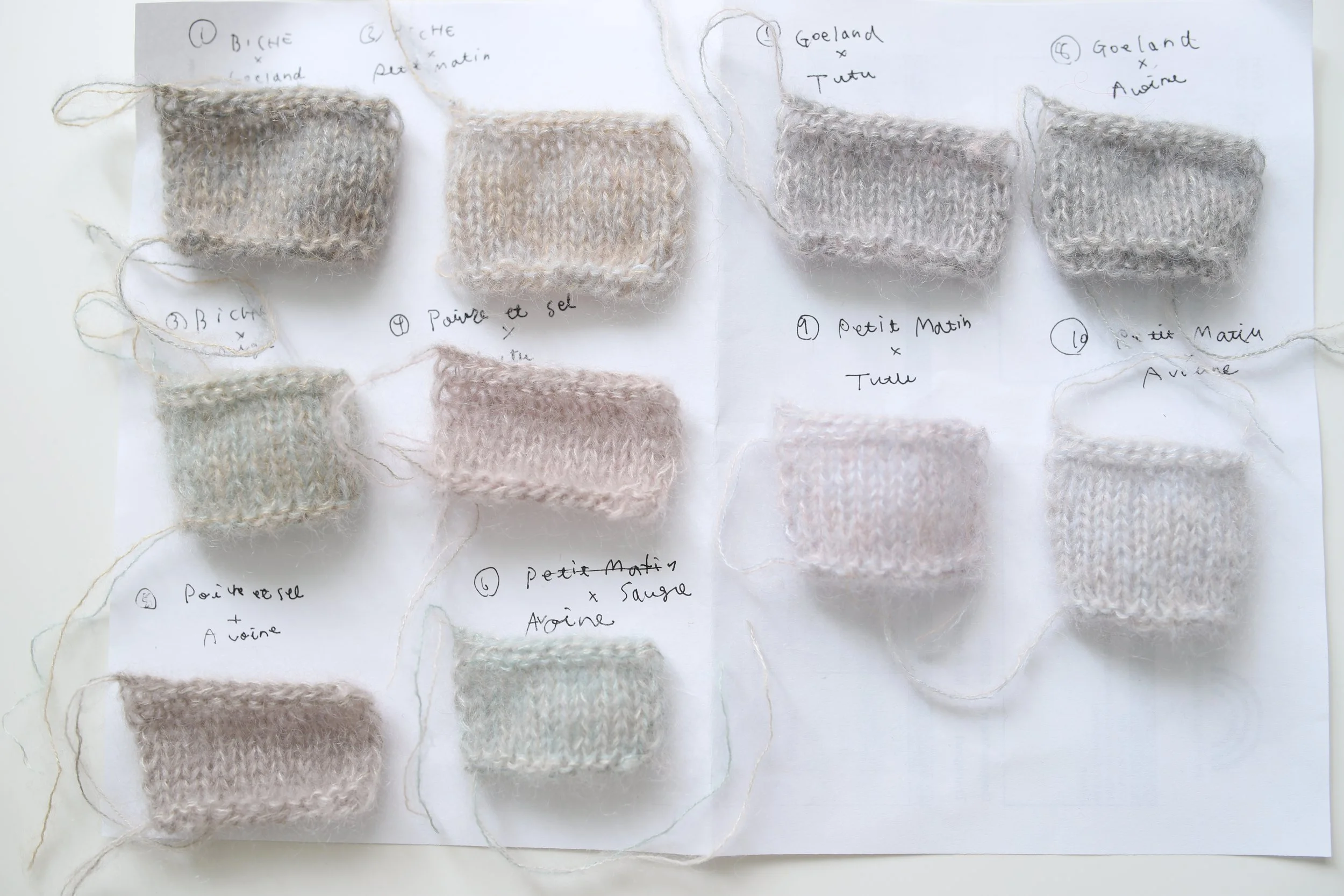
Sometimes through colour and colour combinations, sometimes through stitch patterns and motifs, and sometimes through the choice of yarn itself.
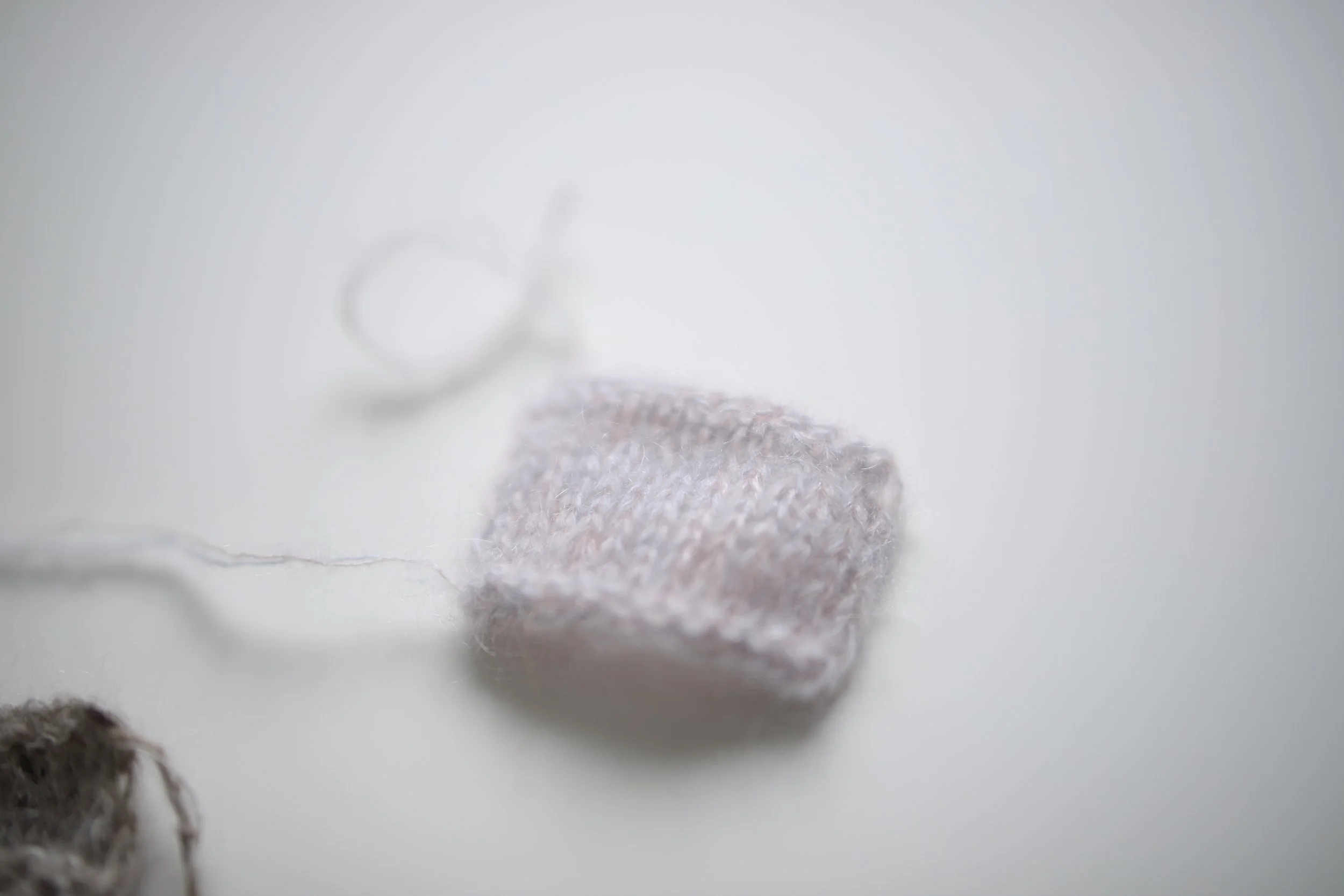
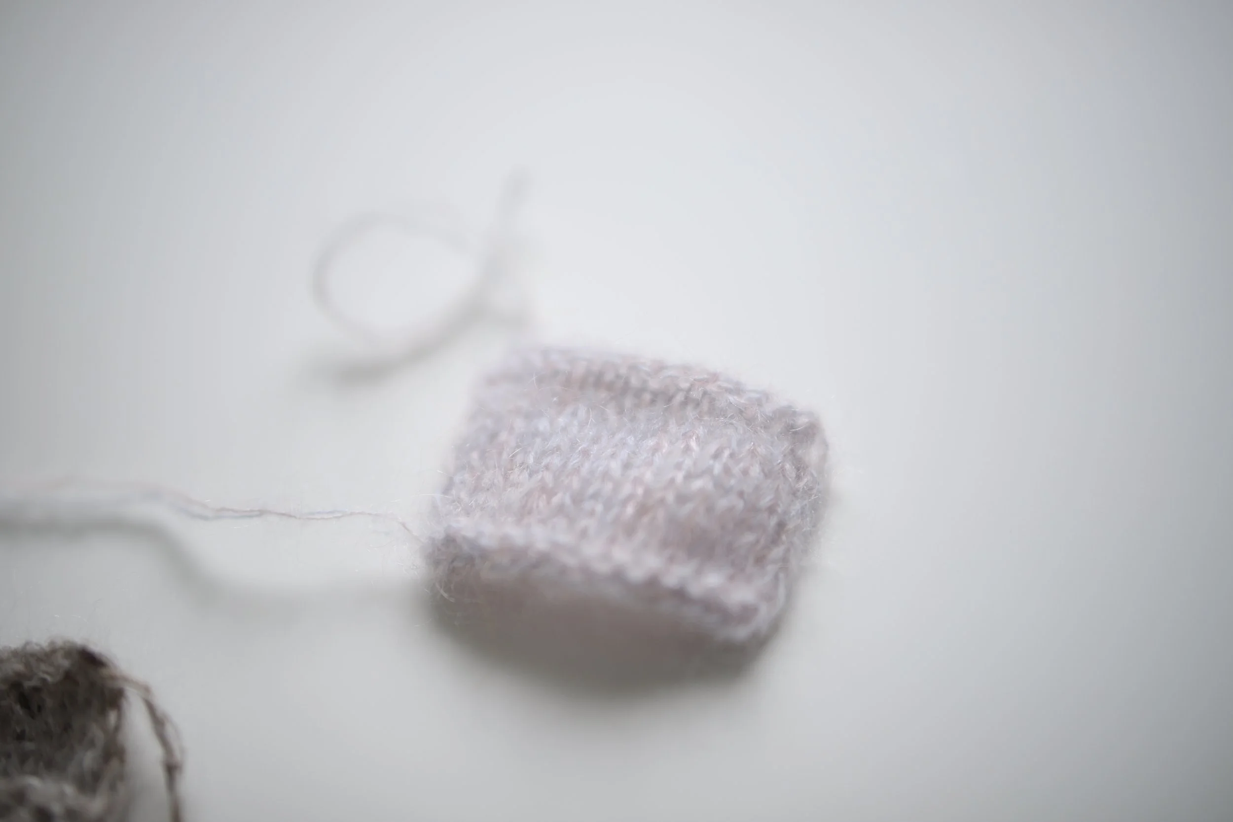
For Mars, for example, I took inspiration from paintings, particularly the complementary colours found in Impressionist works. I was drawn to the way soft pink and pale blue could sit together to suggest the soft, hazy light of spring.
In another piece, a patterned stripe worked in a light summer yarn has something of the feeling of waves to me. I later brought the same pattern into an autumn piece, this time worked in mohair and tweed.
The pattern is the same, but the season feels completely different.
The texture of the yarn gives the pattern a new depth and character, and even the feeling of touching it begins to evoke that particular anticipation of the knitting season returning.
This is how the seasons found their way into Common Thread — not only through colour, but through light, texture, pattern, and the way a piece feels in your hands.
And perhaps this is also something to keep in mind when choosing colours for your own knitting.
If you find yourself unsure of what colours to choose, you may not need to look very far.
The colours you are looking for may already be around you.
Perhaps there is a blanket you have always loved, the colour of your sofa, a favourite piece of pottery, a painting on your wall, or even something as simple as a book cover or a flower.
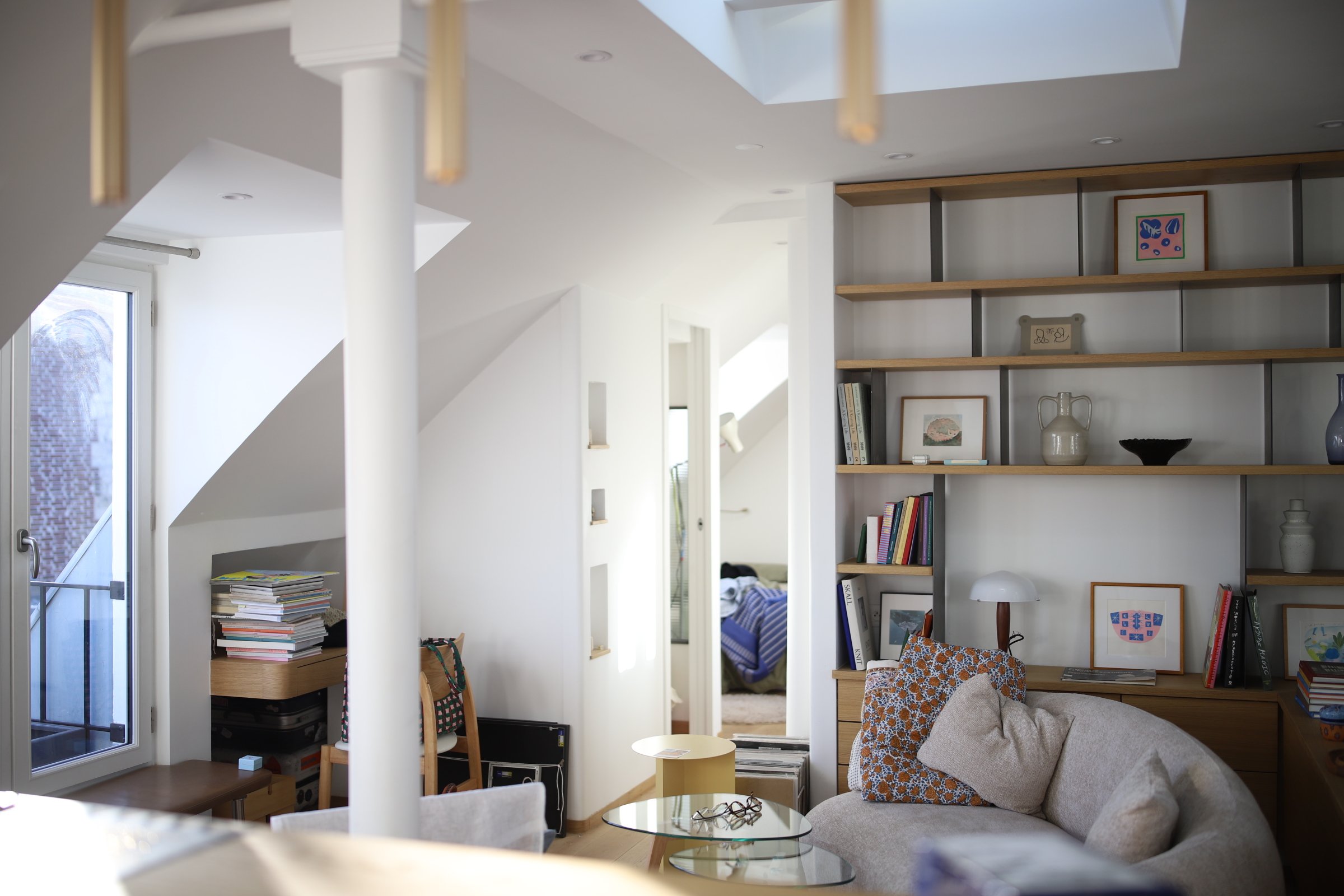
You don't always have to look at clothes or knitted pieces for inspiration. Sometimes the things we have chosen to live with already tell us something about the colours and combinations that feel natural to us.
Look around you. Notice the light, the colours, and the quiet things that catch your eye.
Perhaps your next knitting project is already there, quietly waiting to be noticed.
More to come.
『Common Thread』の舞台裏 04 — 光と場所
『Common Thread』の制作を通して、私は色そのものよりも、むしろ「光」に目を向けるようになりました。
1月から12月まで、それぞれの季節の光をじっくりと観察しました。春の訪れを告げる曙、夜明けの静かな光明、朝霧の中で花がほころび始める気配、夏に向かって強さを増す光線、秋の森で移ろいゆく煌めき、そして冬の小さな灯りがもたらす温もり。
私は、こうした光のさまざまなニュアンスをニットウェアから感じたいと考えました。
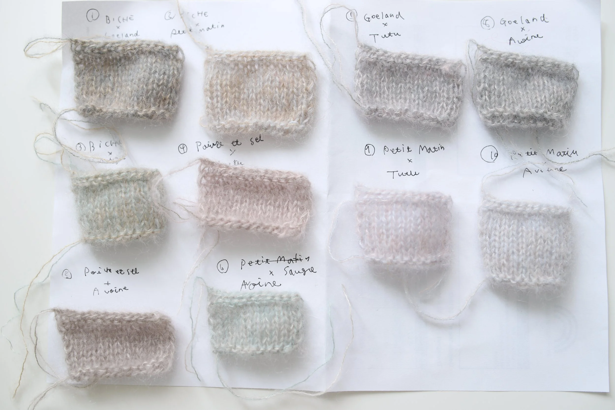
ある時は色や色の組み合わせで、ある時は編み地模様やモチーフで、そしてまたある時は糸そのもの質感の選び方によって。
例えば「Mars・3月のベスト」という作品では、絵画、特に印象派の作品に見られる補色の関係からインスピレーションを得ました。柔らかなピンクと淡いブルーが調和し、春の柔らかく霞んだ光や透明感を思わせるような繊細な雰囲気に惹かれたのです。
別の作品では、軽やかな夏糸で編んだストライプ模様が、私には波のような印象を与えてくれました。後に同じ模様を、モヘアとツイードの糸を使って秋の作品にも取り入れました。
模様は同じでも、季節の気配は全く異なるものになりました。
糸の質感が模様に新たな奥行きと個性を与え、その手触りさえも、編み物の季節が戻ってくることへの期待感を呼び起こしてくれます。
こうして季節は『Common Thread』の中に息づくことになりました。色だけでなく、光、質感、模様、そして手にした時の感触を通して。
そして、これはご自身で編み物の色を選ぶ際にも、心に留めておくと良いことかもしれません。どんな色を選べばいいか迷ったとき、遠くを探す必要はないかもしれません。
求めている色は、すでに身近なところにあるかもしれないからです。
ずっと愛用しているブランケット、ソファの色、お気に入りの陶器、壁に飾った絵、あるいは本の表紙や花といった身近なものの中に。
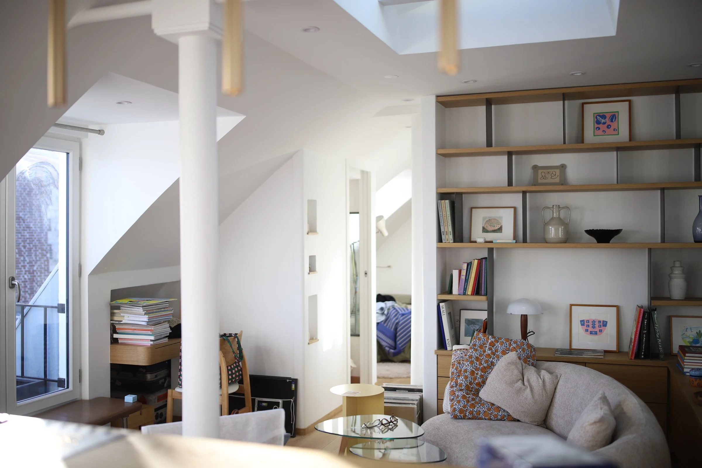
インスピレーションを得るために、必ずしも服やニット作品を見る必要はありません。私たちが日々の暮らしの中で選んできたものこそが、自分にとって自然に感じられる色や組み合わせについて、何かを語りかけてくれることがあるのです。
迷ったとき、ぜひ周りを見渡してみてください。光や色、そしてふと目に留まる静かな気づきに目を向けてみてください。
もしかすると、次の編み物プロジェクトはもうそこで始まりを待っているのかもしれません。
つづく